
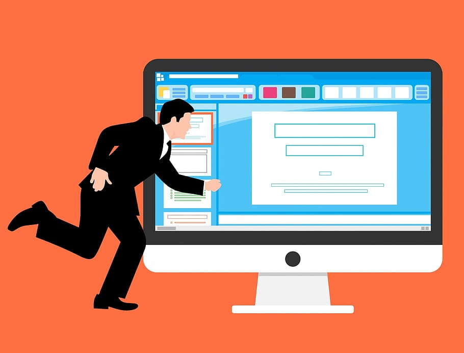
For any business, the website is its shop window on the world. It’s also a calling card that lets potential customers and clients know who you are, what you do and how they can engage with you. For many, your website will be their first point of contact with your business, and that’s why getting it right is so important.
The most important part of any website is the homepage. It is the first thing visitors see when they click through, and in many cases how it looks will make them decide whether to proceed or to move on. That decision will likely be made in just a few seconds, based on both a conscious and unconscious response to how your homepage looks, the message it conveys, and whether the information the visitor needs is readily available.
Not enough information
That brings us to our first common mistake: not presenting enough information on your website homepage. Many businesses take fashionable minimalist design too far and forget that their homepage has to be functional as well as cool.
Don’t assume that your visitor knows anything about your business in advance. Your website homepage should instantly convey what your business is about to someone who has stumbled upon it randomly, as well as serving the more clued-up customer who has used a search engine to find a site dealing with the services or products you offer.
Don’t leave them guessing. Avoid anything that’s too ambiguous or cryptic. Think of the classic six questions that journalists should always try to answer: who, what, where, why, how and when. Tell visitors who you are, what you do, where you are based (if relevant), why they should engage with you and how they can do that (when is generally as soon as possible, though don’t stress that too much). If visitors don’t get the information they need, they’ll look elsewhere.
Too much information
A homepage that is too cluttered and is trying to say too much all at once can be just as bad as one that doesn’t say enough. The essential information needs to be easy to see and not buried in irrelevant detail. You should link to subsequent pages where visitors can find out more about the areas that interest them. Think of your homepage as the cover of a book. It should let them know what the story is about, but don’t try to cram the whole novel on there.
Busy design, too much text, an excess of images can all confuse visitors and will also slow down your site loading. Trying to cram too much in is like a pushy salesman getting right in your face as soon as you walk through the shop door. Many potential customers will just turn around and leave.

Missing your target
Any successful business knows exactly its target market and how to connect with it. If you aren’t sure how to go about this, engaging a company like Wolverine Solutions Group that specializes in targeted marketing programs and services is highly recommended. Wolverine Solutions Group has over 40 years’ experience in connecting clients with their target markets and in ensuring a consistent message across all platforms.
As with all other aspects of your brand, the look and feel of your website should be appropriate to your target demographic. That might mean a conservative, professional approach or something more relaxed, trendy and up-to-date. Whatever you decide, apply it to all levels of design and communication and stick with it. Trying to be all things to all people inevitably leaves you appealing to none.
Lack of contact information
You’d be amazed at how many business websites make their contact details hard to find or even omit them altogether. Your website is a portal that should move visitors further along their journey to becoming customers or clients. To do this, it needs to make it very clear how they can get in touch with you, or at least purchase the product or service in which they’re interested. Contact information should be listed on every page and getting in touch should be a simple click away.
Keep it consistent and relevant
One theme, one logo, one typeface: decide how you are going to be represented and stick to it. Too much variation sends out mixed messages and confuses your visitors. Don’t clog your homepage with irrelevant or off-message images and avoid large blocks of text. Pay attention to fonts and layout. Use space to draw the eye to the important information. All this attention to detail helps to build your brand identity and makes visitors feel secure and confident in what you offer.
A good business website should have a homepage that conveys the relevant information immediately while being pleasant to look at. It should be easy to navigate and intuitive, effortlessly guiding the visitor along their journey. Make sure that it appeals to your kind of people and that they can get in touch with you when they need to. Avoiding the simple mistakes listed above will give you a homepage fit to represent your business to the world.