
The homepage of a website is like the front garden of a property. If you were looking at buying a house, the first impression is a crucial moment. It’s no different with online businesses. A commercial website, regardless of the industry, whether it is a therapist or a wholesaler, needs to have clarity and precision above all else. When you create a space that is user-friendly, to the point, and interesting, the chance of the rest of the site being engaged increases. So, here are five useful homepage design tips that will make life easier.
Make It Obvious
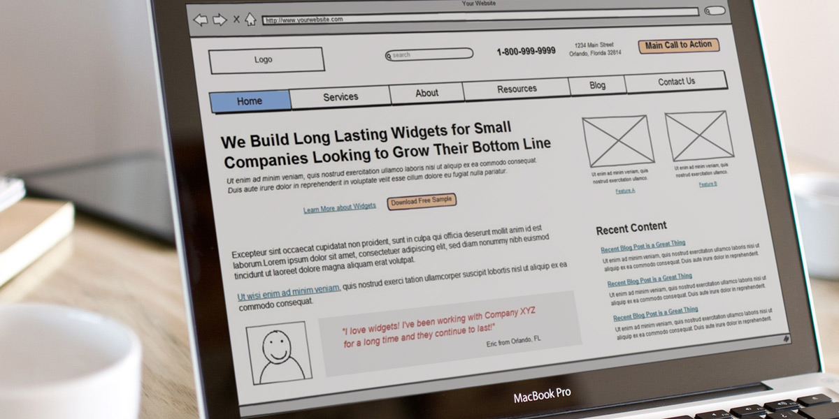
What are you trying to achieve with this website? Do you want people to look at products or make inquiries? The main purpose of the site should always be transparently represented, designed well and easy to figure out. Nobody wants to spend time guessing what you’re all about and how to get in touch. One common mistake is not including a really obvious, hard-to-miss point of engagement as the first thing people see when they load your site. Anything from a search bar to a paragraph about who you are will do the trick, as long as it’s there in plain sight!
Include a Compelling Call to Action
Calls to Action are useful initiatives that encourage engagement from a potential customer or consumer. They are buzz phrases like ‘call today’ or ‘fill out our inquiry form’ that motivate people to connect with what’s on offer. When you include a call to action on your homepage, there is a clear message for anyone looking that you want them to get involved and follow through on their curiosity. This could lead to more sales, general engagements, and people coming back for more.
Don’t Be Repetitive
There are plenty of tools you can use on your homepage to make it more appealing to your client base and target demographic too. One big thing that puts people off is when a homepage says the same thing over and over, has limited language variation in its approach and doesn’t use professional-style vocabulary or grammatical structure. There is a balance to be found between formal and informal, but the key is to remain professional. You can find a lot of useful ways to mix up your word choice by using a tool like Unscramble.me, a popular platform for unscrambling anagrams and finding new words to work with. Don’t get caught out on a simple thing, and make sure what you’re saying is as appealing as what you’re selling.
Make People Want to Come Back
A website depends on the people who visit to make it viable. If people don’t come back, it is normally because there is a fatal flaw with your homepage. This is the moment where you are best able to drum up the most excitement, and if it’s done right, people are bound to come back. This is especially true if you include things like an RSS feed that enables access to essential updates even when users are not connected to the online world.
Put Membership and Subscription Options Centre-Stage
Alongside a helpful call to action, the other tools that lots of companies implement are subscription and membership options right there on the front page. This is typically a simple form, and maybe even a pop-up promotion with a discount or freebie for anyone who signs up to receive updates. This is all a big part of a wider email marketing strategy but it is extremely effective and tends to have a high success and engagement rate overall.
Homepages have to be perfect. These are the places that make people say yes or no to moving forward, and help widen the audience of the business too. There should always be a focus on making it as user-intuitive as possible while complementing this with additional processes too.